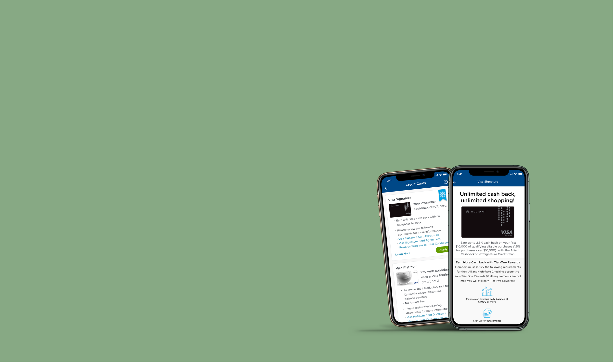
VISA Signature Credit Card Opening
Bringing Alliant’s first loan product - credit card application process to mobile app
Overview:
This project introduced the first lending experience within Alliant’s mobile app, a major platform milestone. Until this effort, members were required to leave mobile and complete lending actions through online banking or desktop flows.
Users: The primary audience was existing Alliant members seeking a fast, trustworthy way to apply for a credit card on mobile
Primary Goals:
Establish a scalable mobile lending foundation
Reduce friction in the credit card application process
Align mobile experience with competitor standards
Increase completed and approved applications
Role
Lead UX Designer
6 months
Timeline
Collaboration
Product Owners, Business Owner, Developers, Compliance, Data Analytics, Marketing
Tools
Figma, Medallia DXA, Figjam, Usertesting.com, Google Analytics
Problem
Problem
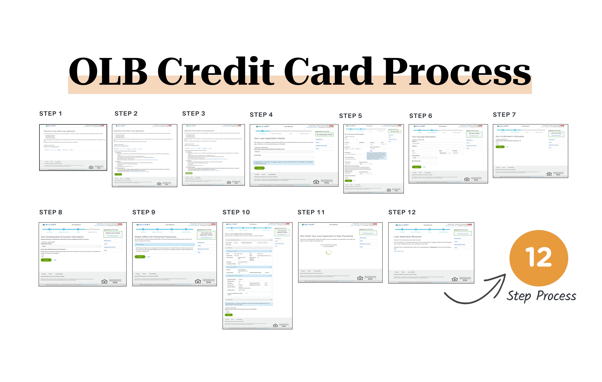
Alliant had no prior mobile lending patterns, creating both a UX challenge and an opportunity. Members experienced the existing credit card application as overly long, confusing, and misaligned with mobile expectations.
Key Challenges:
No Mobile Lending Baseline: This was the first lending product, requiring new patterns, components, and compliance considerations
Lengthy Process: High abandonment due to excessive steps and fields
Cognitive Load: Desktop-style density translated poorly to mobile
Competitive Gap: Mobile experience lagged behind peer financial institutions
Research
Research & Insights
Understanding Member Friction
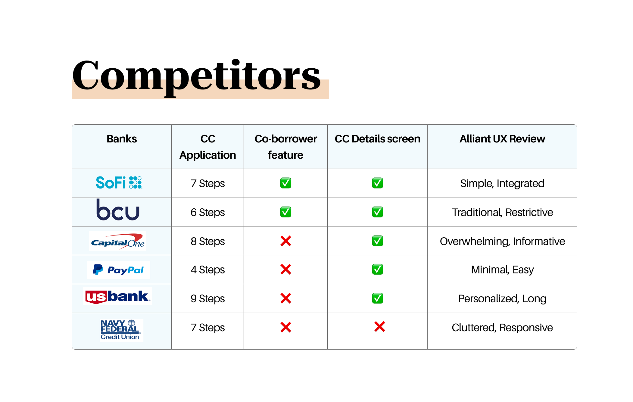
Research focused on identifying friction points within the existing credit card application and understanding mobile expectations for lending experiences. I reviewed Google Analytics application data, DXA heatmaps, and Medallia member feedback, alongside a detailed competitor analysis of leading banks and credit unions.
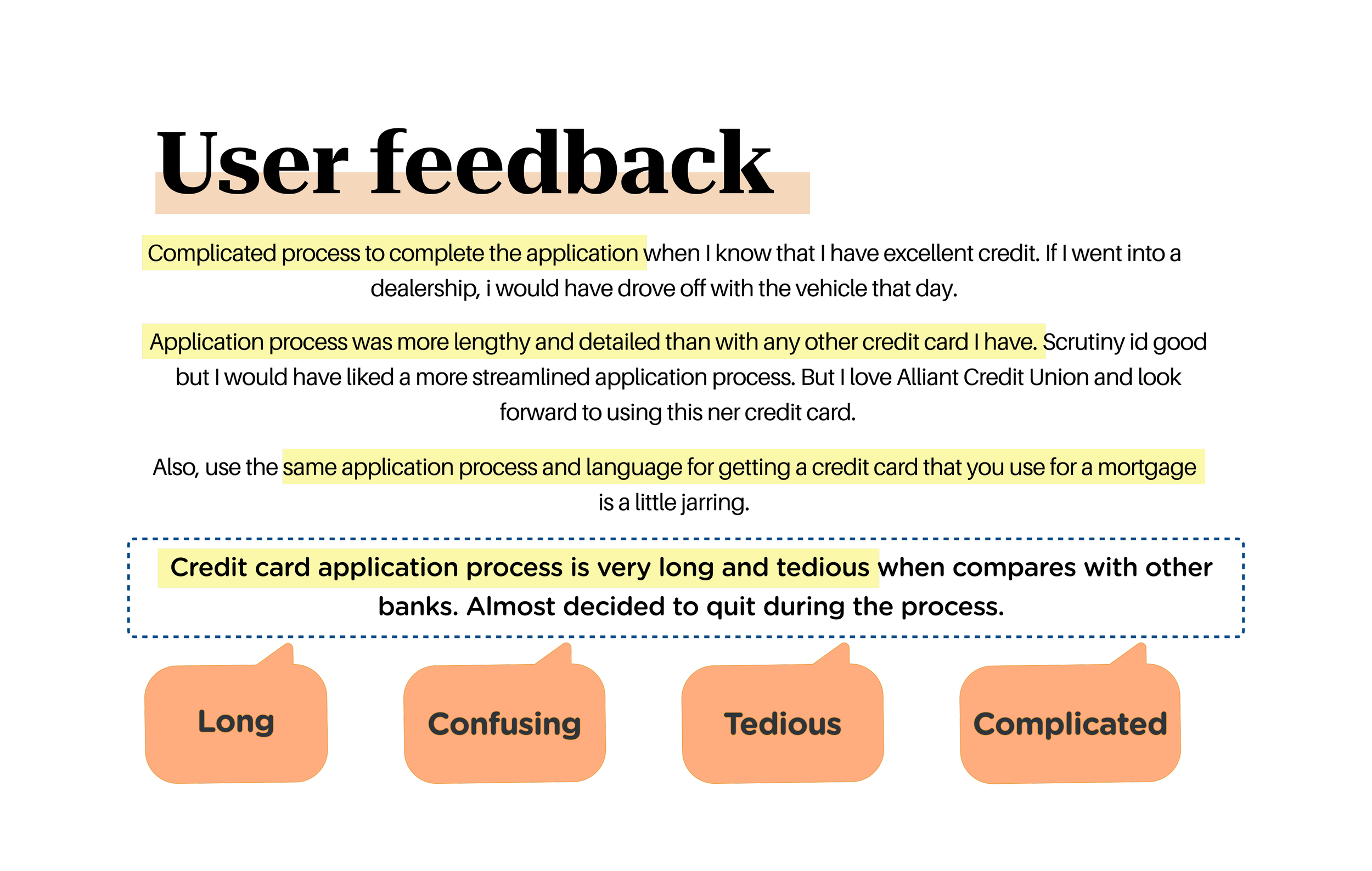
Findings showed a significant gap between Alliant’s 12-step desktop-based flow and competitor mobile experiences averaging 4–9 steps. Member comments consistently described the process as long, tedious, and confusing, reinforcing the need for a fundamentally restructured mobile-first application rather than a direct port of the desktop experience.
Online banking CC application drop off was high
Google Analytics showed 4,807 unique credit card application views in October 2023, but a significant drop between application start and approval.
Competitors Prefilled Data
5 out of 7 competitors prefilled known member information, reducing effort and errors.
Application Fatigue
Member feedback repeatedly described the flow as “long, confusing, tedious, and complicated.”
“Almost decided to quit during the process.” — Medallia feedback
Users Wanted Transparency
Competitors often included a “View Details / Learn More” step to explain benefits upfront, which Alliant’s mobile flow lacked.
Ideation & Concept
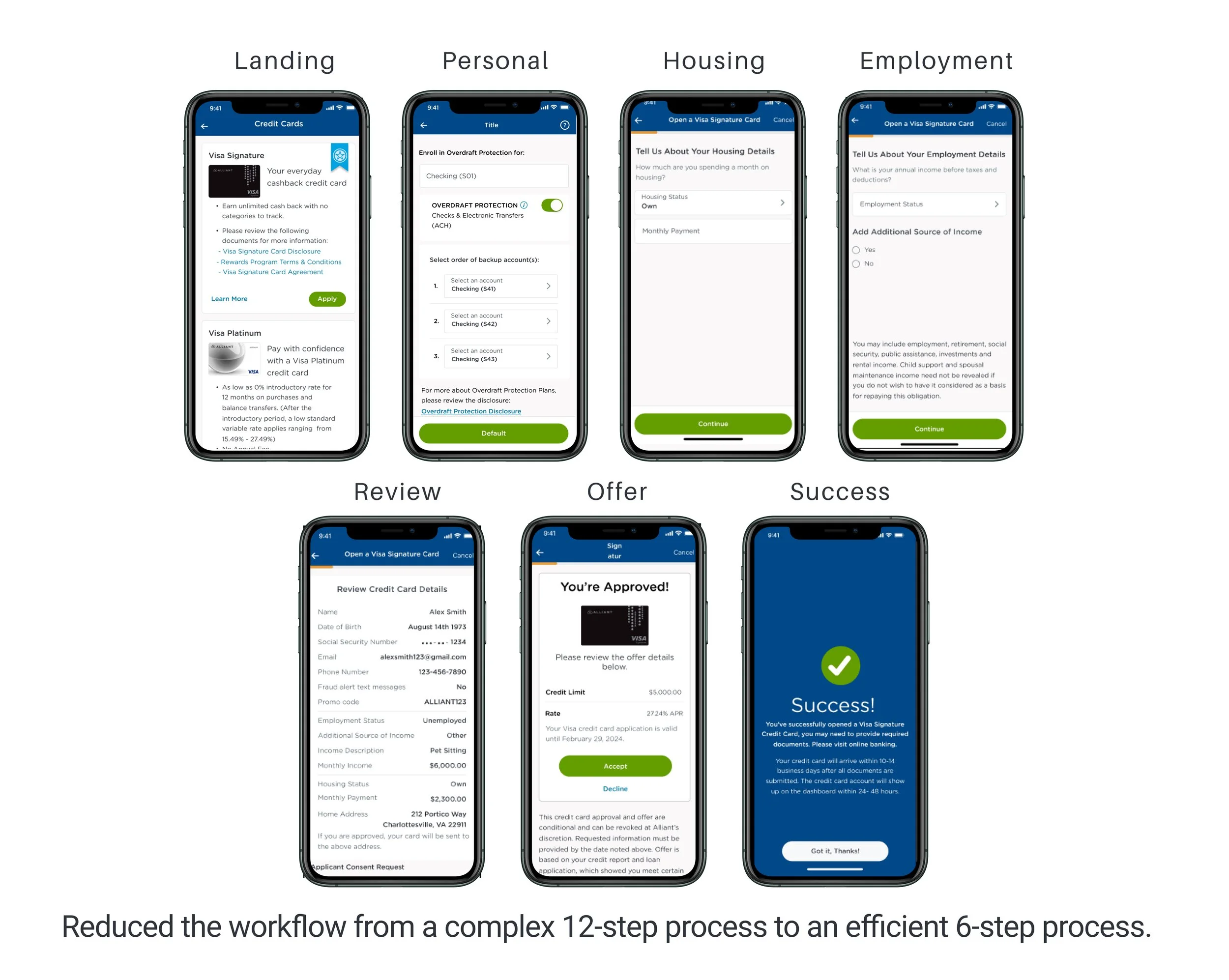
To reduce friction in Alliant’s first mobile lending experience, I re-architected the credit card application from a 12-step desktop-driven flow to a focused 6-step mobile journey. By consolidating related inputs, introducing single-task screens, and applying progressive disclosure, the new design significantly improved clarity and momentum while preserving all compliance requirements. The result was a faster, more intuitive application experience aligned with modern mobile banking standards.
Focus Areas:
Data-Driven Diagnosis: Analyzed funnel analytics, heatmaps, competitor flows, and member feedback to identify structural friction in the existing desktop-based application.
Flow Re-Architecture: Rebuilt the experience as a mobile-first journey, reducing the application from 12 steps to a focused 6-step flow while preserving all required inputs.
Iterative Design & Validation: Developed and refined wireframes and high-fidelity prototypes through close collaboration with product, engineering, compliance, and marketing.
Accessibility-First Execution: Designed and reviewed the flow with ADA and screen-reader support in mind, accounting for multiple employment scenarios and edge cases.
Multiple interaction patterns were explored through sketches and low-fidelity wireframes, which were then narrowed down into two viable concepts for validation.
Process
End-to-End 6-Step Mobile Flow
The application was redesigned into six clear stages:
Landing / Card Selection
Personal Details (prefilled where possible)
Housing Information
Employment & Income
Review & Submit
Offer & Success
This structure replaced a fragmented 12+ step desktop flow and reduced perceived effort while preserving compliance integrity.
Solution
Solution
The final solution delivered a native, mobile-first lending experience, transforming a dense desktop credit card application into a clear, approachable mobile journey. Instead of porting the existing flow, the experience was rebuilt to prioritize clarity, momentum, and member confidence while meeting regulatory requirements.
The application was restructured into a six-step end-to-end flow, replacing the original 12-step process. Each step focused on a single primary task, reducing cognitive load and helping members progress more easily. Known member information was leveraged where possible to minimize manual input and speed completion.
Accessibility was foundational to the solution, with screen-reader support, clear validation messaging, and logical focus order across all steps and employment scenarios. The resulting experience established reusable mobile lending patterns, creating a scalable foundation for future lending products.
Accessibility
What did the users think about the new UI?
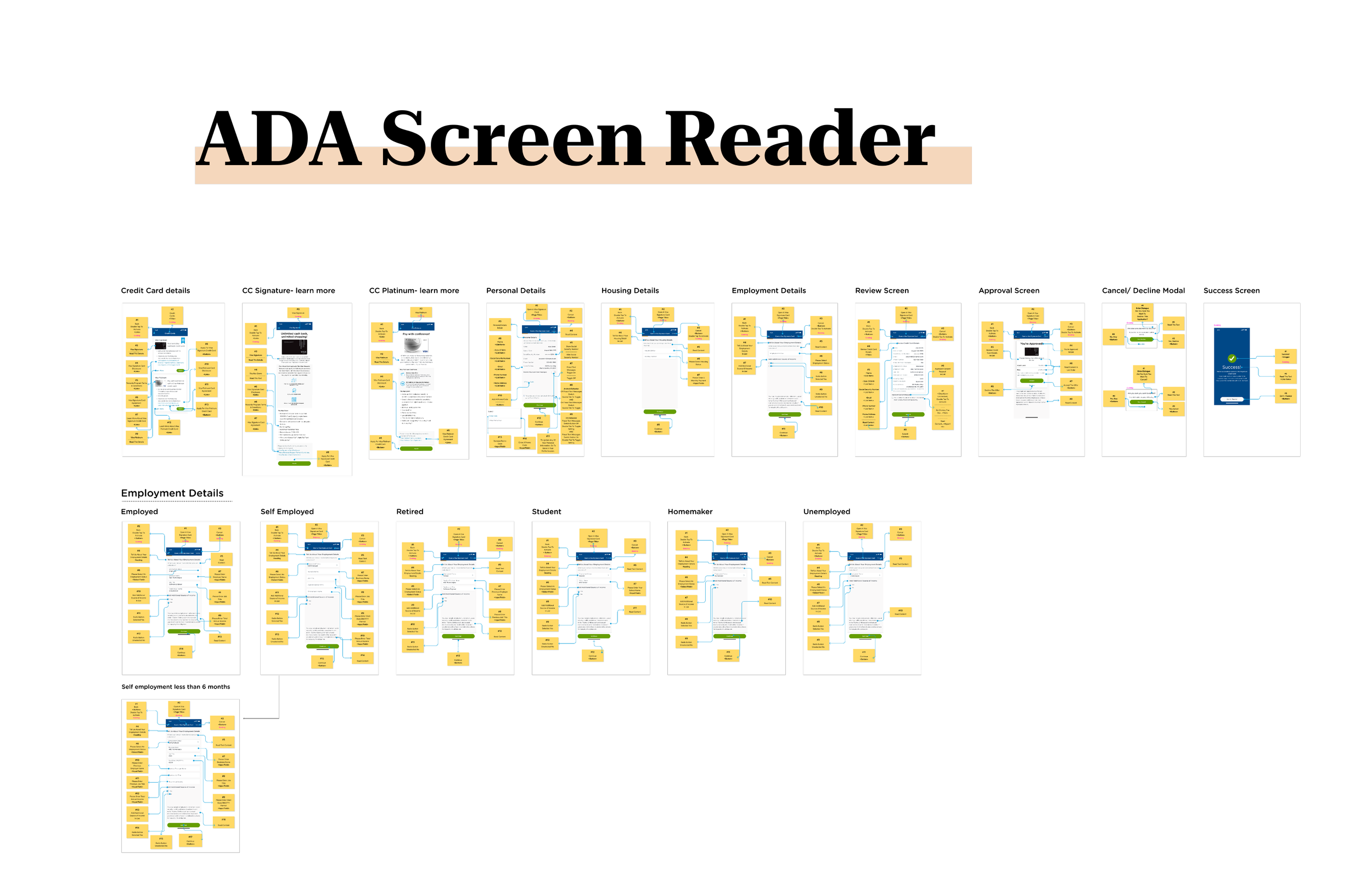
Accessibility was treated as a core design requirement, not a post-design checklist. Because this was Alliant’s first mobile lending product, ensuring the experience worked for all member including those using assistive technologies. ADA considerations were embedded throughout the application flow to support clarity, predictability, and equal access across complex form interactions..
Accessibility considerations included:
Screen Reader Optimization: Logical reading and focus order across all steps to ensure the application could be completed end-to-end using VoiceOver and TalkBack.
Clear Labels & Validation: Descriptive field labels, helper text, and inline error messaging designed to be announced clearly by screen readers.
Consistent Interaction Patterns: Reusable input behaviors and button placements to reduce cognitive load for users relying on predictable navigation.
Multiple Employment Scenarios: Accessible flows for employed, self-employed, retired, student, and unemployed paths without breaking screen-reader logic.
This work established accessibility patterns that could be reused across future mobile lending products.
Key Achievements (Post-Launch):
Simplified Workflow: Reduced the application flow from a 12-step desktop process to a focused 6-step mobile experience. The reduction in steps allows for quicker completion times, improving overall satisfaction and engagement.
First Mobile Lending Launch: Successfully released Alliant’s first lending product in the mobile app, establishing reusable lending UX patterns.
Improved Clarity & Efficiency: Each step was redesigned with a single primary task, reducing cognitive load and improving completion momentum.
Accessibility by Design: Built with screen reader and ADA considerations across all application paths, including employment status variations.
Observed & Supporting Data:
25,144 applications started (Jan–July 2025)
15,501 applications submitted
5,654 applications approved
Reduction from 12 → 6 steps aligned with competitor benchmarks (4–9 steps)
“Credit card application process is very long and tedious when compared with other banks. Almost decided to quit during the process.” — Medallia (pre-redesign).
Impact
How much impact did the parity make?

Takeaway
Reflection
This project reinforced the importance of designing financial products that feel appropriate to their context. A credit card application should not feel like applying for a mortgage.
Key Learnings
Designing Under Compliance Constraints: Clear UX can coexist with regulation
Mobile ≠ Desktop: Mobile-first thinking requires re-evaluating every step
Data-Informed Design: Analytics and qualitative feedback together tell the full story