Overdraft Protection & Courtesy Pay
Bringing Overdraft Protection and Courtesy Pay to mobile without increasing complexity.
Overview:
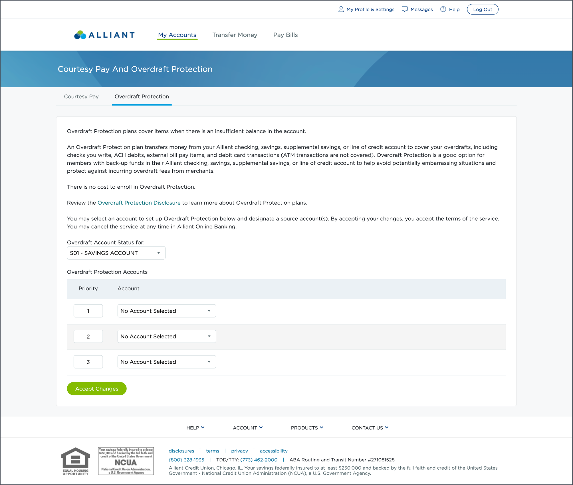
Overdraft Protection and Courtesy Pay act as financial safety nets, allowing members to complete transactions even when account balances are insufficient. Prior to this project, these features were available only in Online Banking, creating a fragmented experience for mobile-first users.
Users: Existing members using mobile banking
Primary Goals:
Achieve functional parity between Online Banking and Mobile
Increase member confidence and adoption of overdraft-related features
Support deposit growth by reinforcing minimum balance requirements
Role
UX Designer
12 weeksTimeline
Collaboration
Product Owners, Business Owner, Developers, Compliance, Data Analytics
Tools
Figma, Medallia DXA, Figjam, Usertesting.com, Google Analytics
Research
Research & Insights
Overdraft Protection and Courtesy Pay allow members to complete transactions even when account balances are insufficient, preventing declined payments and embarrassment. While these features existed in Online Banking, they were not available on mobile which created friction for mobile-first members and limiting overall adoption.
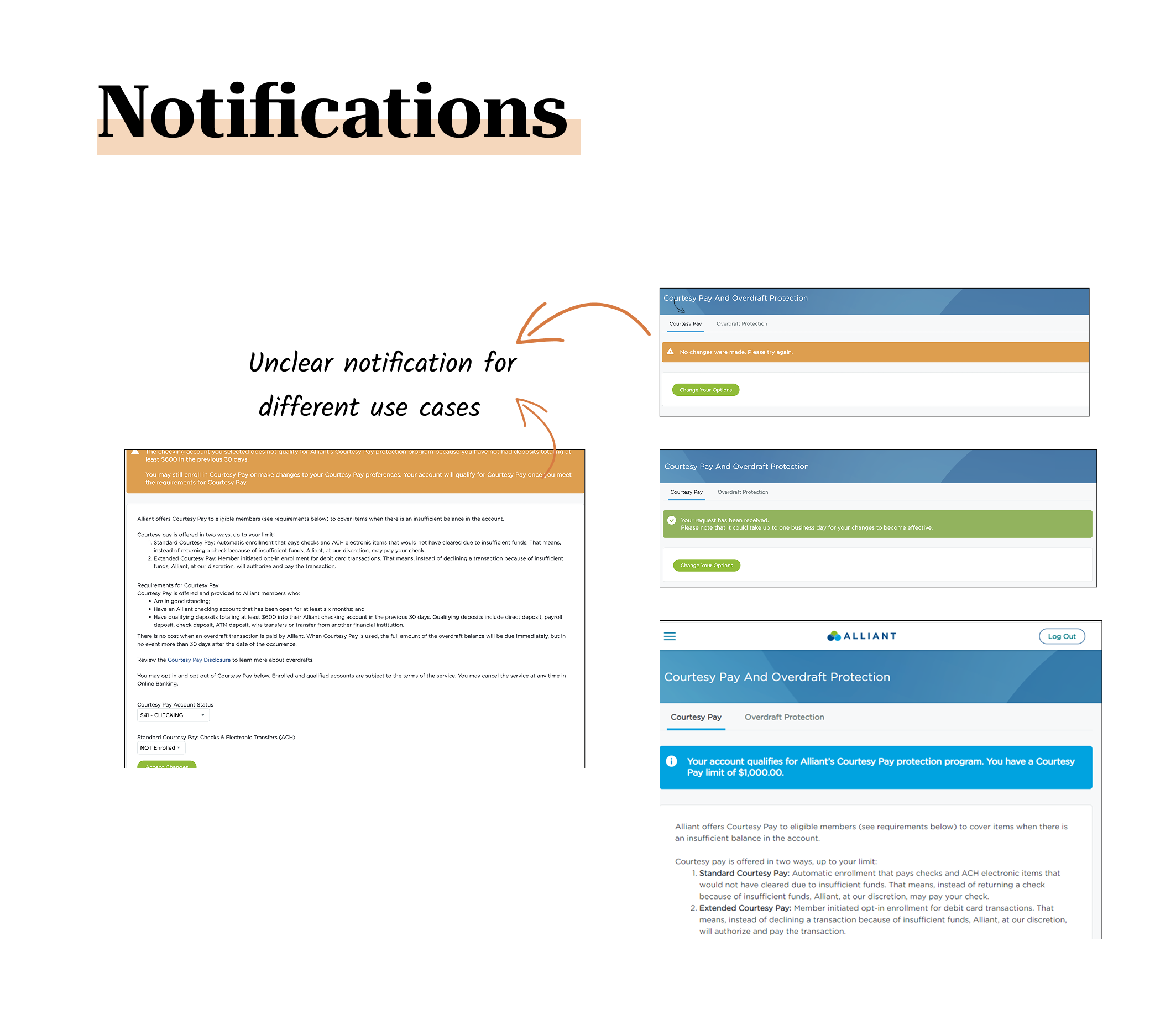
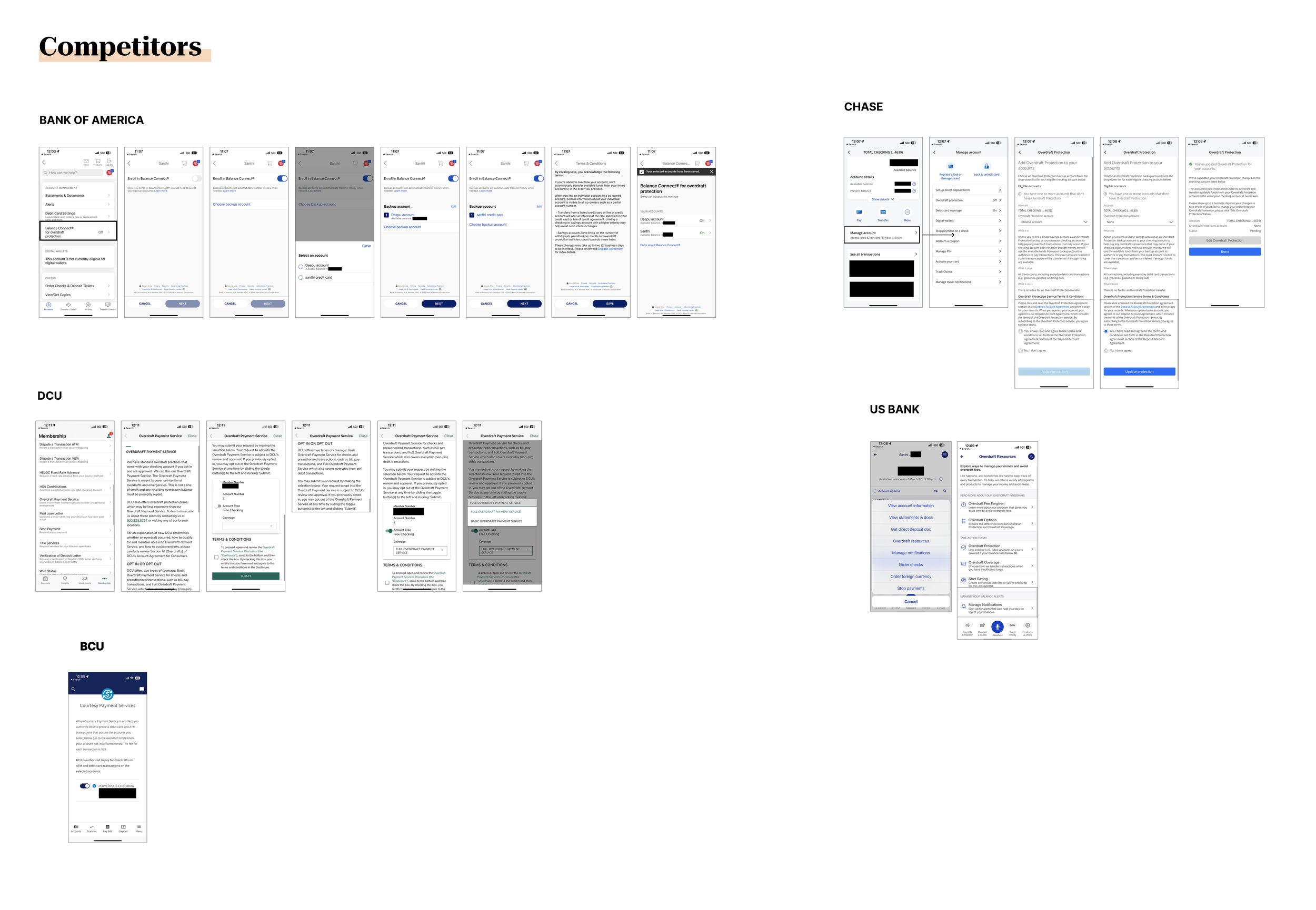
I evaluated the existing Online Banking experience to understand why adoption was low. Through a heuristic review, I identified usability gaps, unclear affordances, and moments where users lacked confidence to proceed.
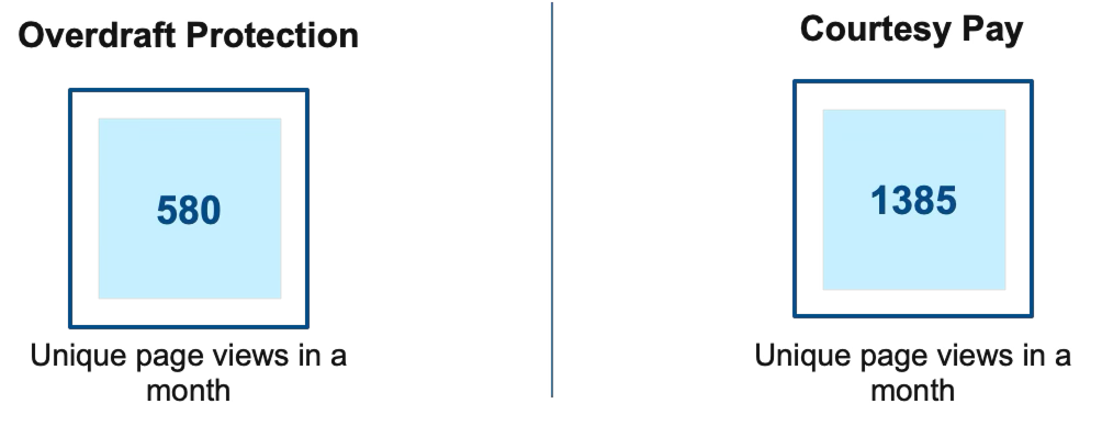
To validate these findings, I analyzed Google Analytics data, which showed relatively low unique page views for both Overdraft Protection and Courtesy Pay indicating discoverability and engagement issues rather than lack of need.
Key Insights
Discoverability Issues most actions were buried in the interface, making the feature easy to miss.
High Cognitive Load due to financial language and disclosures discouraged exploration.
Toggle as Mental Model : 3 out of 4 competitors used toggle switches, reinforcing familiarity and keep actions simple.
As a result of this, adoption of Overdraft Protection and Courtesy Pay remained low despite clear member need, driven by unclear eligibility rules, confusing system feedback, and lack of mobile access. This led to missed deposit growth opportunities, increased support costs, and weakened member trust during high-stress financial moments.
Problem
Low engagement
Despite strong member need, adoption remained low due to unclear qualification rules, misleading messaging, and the absence of a mobile-first experience.
Members lacked confidence in managing Overdraft Protection and Courtesy Pay due to unclear qualification criteria, confusing error messages, and inconsistent system feedback. The absence of mobile access further compounded the issue, forcing members to switch platforms or abandon tasks during time-sensitive, high-stress financial situations.
As a result of this, adoption of Overdraft Protection and Courtesy Pay remained low despite clear member need, leading to missed deposit growth opportunities, increased support costs, and erosion of member trust.
Ideation & Concept
Based on insights from the heuristic review, analytics, and competitor patterns, I facilitated an ideation phase focused on reducing cognitive load while increasing transparency and control.
Ideation Focus Areas:
Clear qualification and eligibility messaging
Simple enable/disable controls with strong feedback
Progressive disclosure for legal and compliance content
Single-screen completion wherever possible
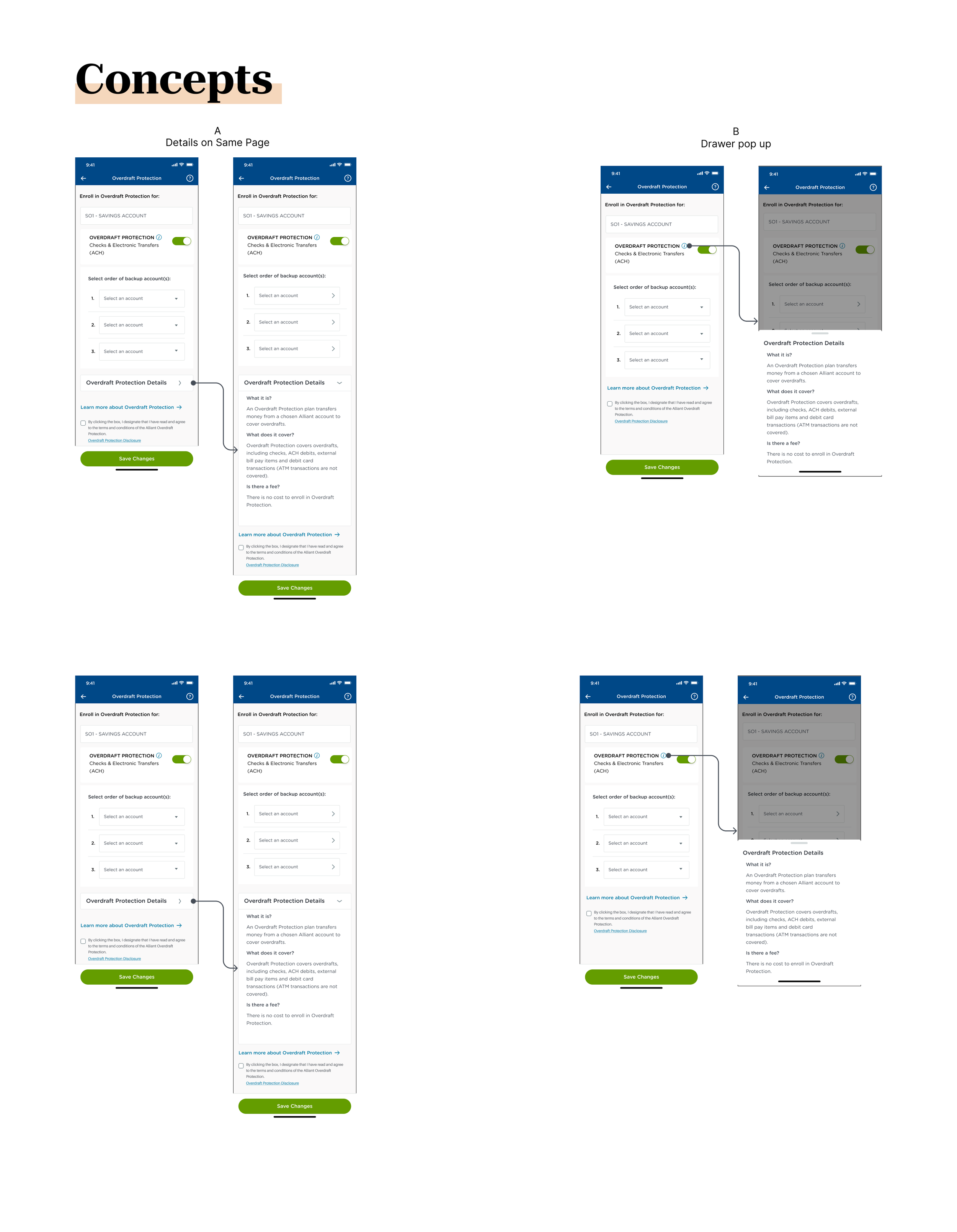
Multiple interaction patterns were explored through sketches and low-fidelity wireframes, which were then narrowed down into two viable concepts for validation.
Concept Testing
Two concepts were tested with participants to validate usability and preference:
Concept A: All information and disclosures presented directly on the main screen
Concept B: Toggle-based control with an information icon leading to disclosures on a separate screen
Result: Concept B was preferred by 34 out of 50 participants, largely due to reduced clutter, clearer control, and better comprehension.
ideation
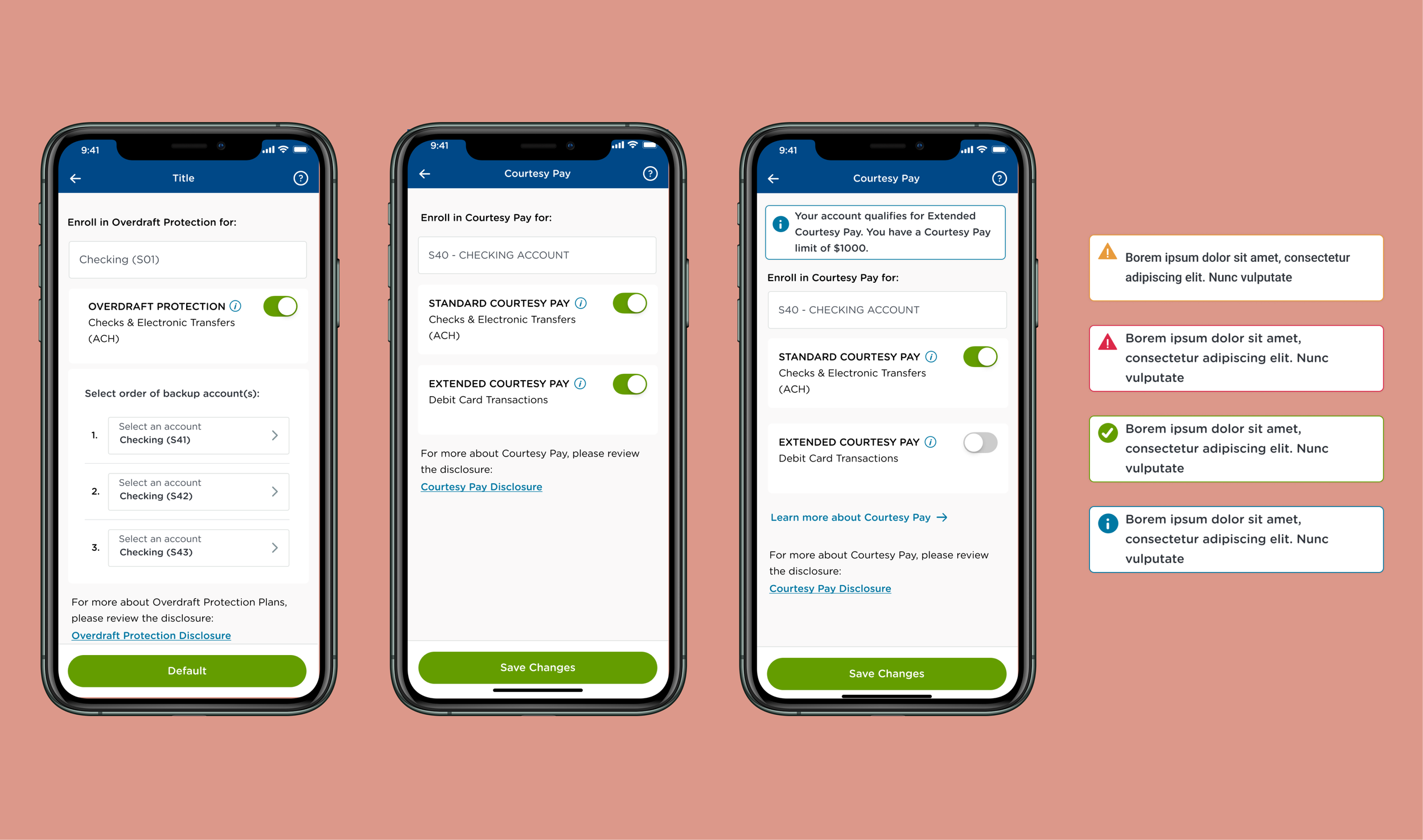
Based on insights the solution delivers full parity with Online Banking while significantly improving clarity and usability. Members can easily understand eligibility, enable or disable features using familiar controls, and access disclosures on demand without disrupting the primary flow.
Key design outcomes include:
Toggle-based enablement aligned with industry standards
Clear system feedback and confirmation states
Progressive disclosure for compliance and legal content
A single-screen flow that minimizes friction and abandonment
Solution
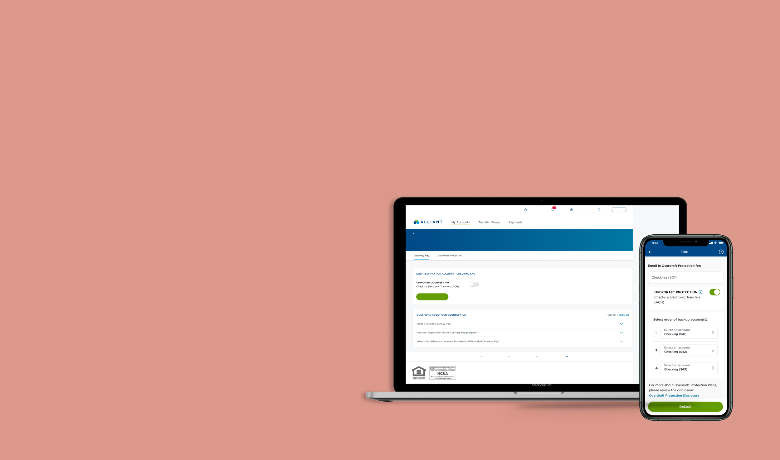
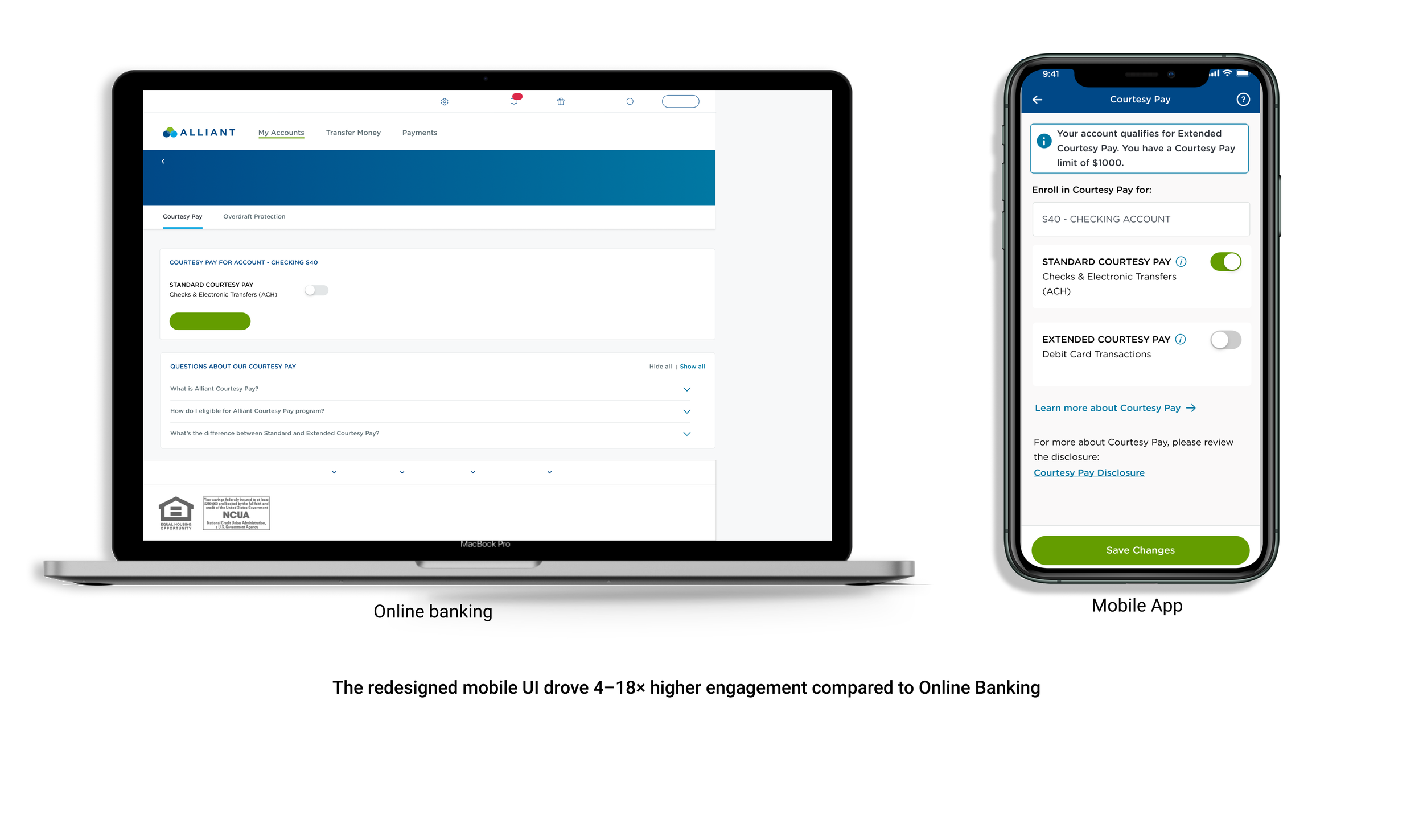
How did the mobile UI look like?
User Testing
What did the users think about the new UI?
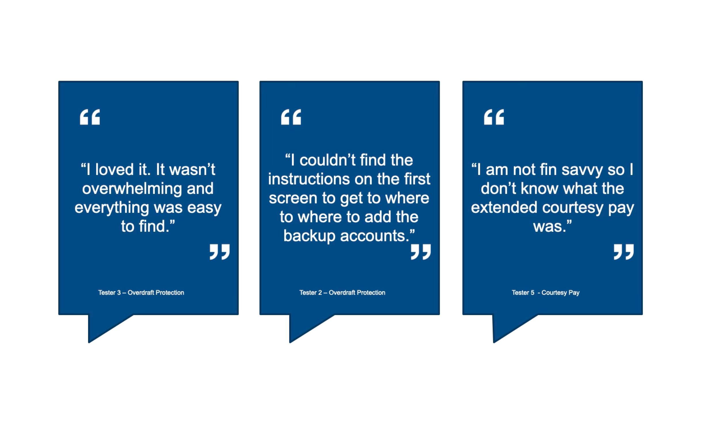
User testing confirmed the redesigned mobile experience was both efficient and confidence-building. In remote usability testing, 100% of participants successfully completed both the Overdraft Protection and Courtesy Pay flows, with an average completion time of 1 minute and 50 seconds, well under the 2-minute target. Satisfaction scores were strong, with Overdraft Protection achieving an NPS of 40 and Courtesy Pay reaching an NPS of 60, indicating high clarity and ease of use.
As one participant noted,
“I loved it. It wasn’t overwhelming and everything was easy to find.”
Following the redesign and rollout of Overdraft Protection and Courtesy Pay to mobile, engagement shifted decisively to the mobile app which is confirming that the updated UI better aligned with member behavior and expectations.
Courtesy Pay:
Online Banking: 1,073 page views
Mobile App: 4,905 click engagements
Overdraft Protection:
Online Banking: 287 page views
Mobile App: 5,253 click engagements
This outcome demonstrates that simplifying controls, clarifying eligibility, and providing a mobile-first experience significantly improved engagement with these high-trust financial features. The redesigned UI reduced friction, reinforced confidence, and positioned mobile as the primary channel for managing overdraft-related decisions.
Impact
How much impact did the parity make?
Takeaway
Reflection
This project reinforced the importance of designing for trust, not just usability—especially in financial contexts where uncertainty can quickly erode confidence.
By grounding decisions in heuristic analysis, behavioral data, and validation testing, I was able to balance business goals, compliance requirements, and member needs. The experience also highlighted the value of early cross-functional alignment with engineering, marketing, and compliance partners.
Key Learnings:
Familiar patterns reduce hesitation in high-stakes flows
Clear system feedback is essential for financial transparency
Progressive disclosure is critical for balancing clarity and compliance much impact did the parity make?